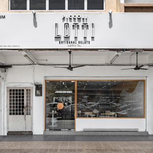
Skillet At 163
| Project | Skillet At 163 |
| Location | Menara Fraser, KL |
| Type | Retail |
| Size | 2500 sqft |
Modern European-inspired Luxury Hotel Design
The challenge:
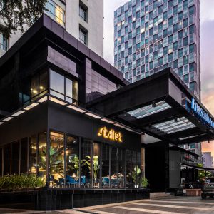
Skillet at 163 is not unfamiliar to foodies as a casual fine dining spot but as their popularity grew, their menu grew finer too and the preexisting interior did not reflect the sophistication of the Modern European cuisine served. How do we transform the space that is reminiscent of modern-day Europe?
The Ground Up solution:
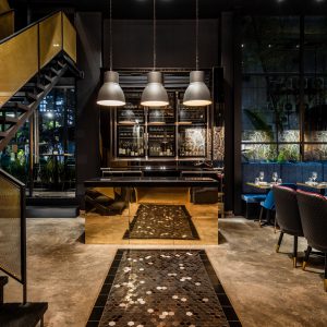
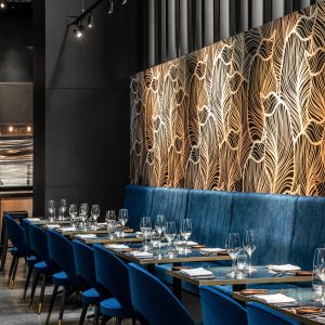
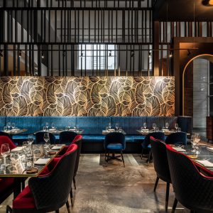
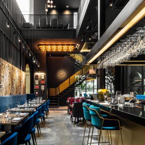
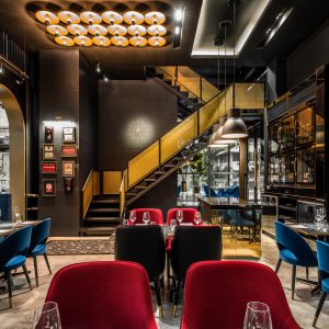
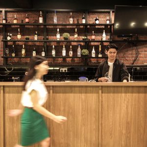
We stepped in and introduced contemporary European-inspired hotelier luxury which embodies the essence of the cuisine served.
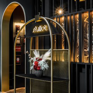
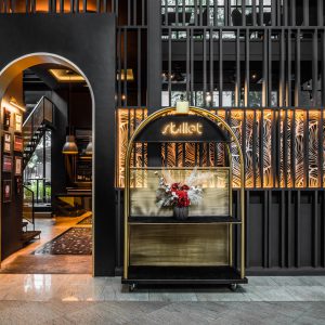
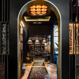
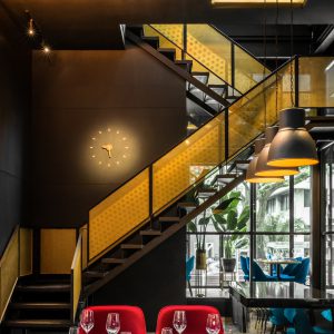
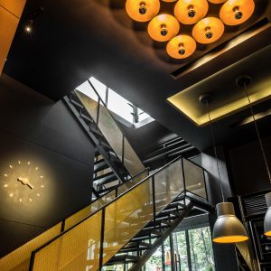
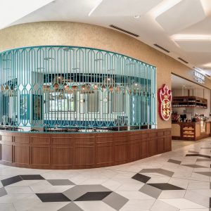
The entrance had to be a spectacle on its own. We designed a portable door inspired by a hotel baggage trolley as an ornamental and functional device. The golden archway which leads into the restaurant aims to create an impression that patrons are in for an unforgettable experience.
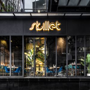
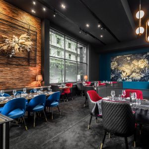
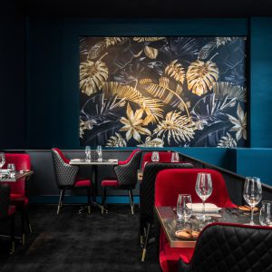
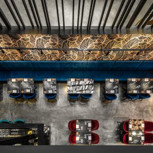
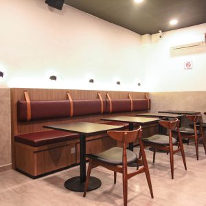
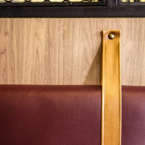
Upon entering, one would be greeted by black & gold hexagon tiles, brass finishes, and exquisite decorative lights that give of a yellow hue adorned the black walls which create a classy yet timeless interior. Add in a touch of botanical European wallpaper and plush seating to the space to further enhance its glamour.
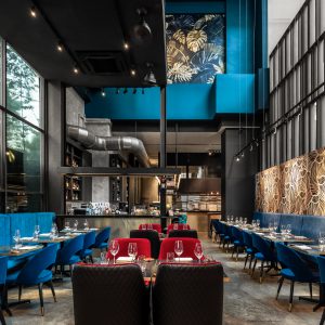
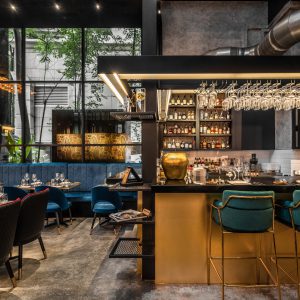
The original underutilized alfresco area outside the establishment was framed up with steel and glass panels which transformed it into an astounding dining area that lends sophistication to the existing building façade. The glass box was also designed to be transformative so that it could turn into a private, exclusive event space.