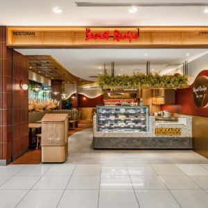
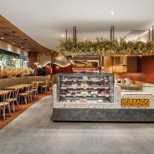
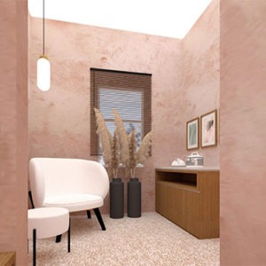
Secret Recipe Gurney Plaza
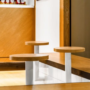
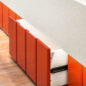
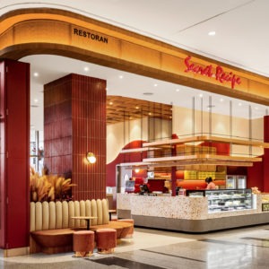
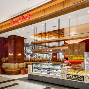
| Project | Secret Recipe |
| Location | Gurney Plaza, Penang |
| Type | Retail |
| Size | 1755 sqft |
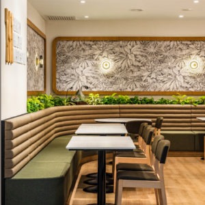
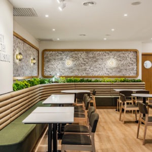
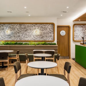
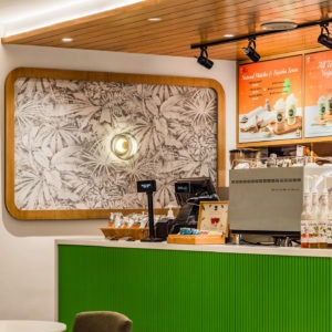
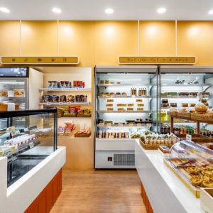
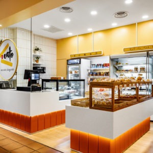
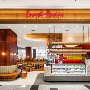
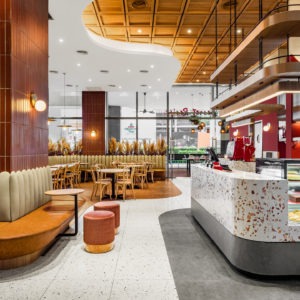
| Project | Secret Recipe |
| Location | Gurney Plaza, Penang |
| Type | Retail |
| Size | 1755 sqft |
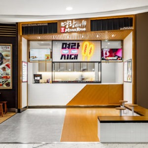
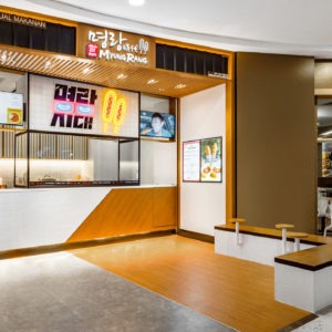
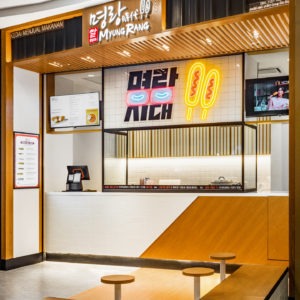
| Project | Myungrang Malaysia |
| Location | Sunway Pyramid |
| Type | Retail |
| Size | 500 sqft |
The Myungrang outlet exudes a harmonious blend of modern minimalism and subtle traditional undertones. Dominated by a warm wooden facade, vertical slats are meticulously arranged, creating rhythmic patterns that offer both visual interest and a sense of depth. The bold and luminescent signage, splashed with vibrant hues, effortlessly captures attention, serving as a beacon for patrons and contrasting brilliantly with the muted tones of the establishment. Below, an avant-garde, sloping wooden bench offers an innovative seating solution, merging form and function, while encouraging casual, communal dining. Delicate lighting fixtures, strategically positioned, cast a soft, ambient glow, enriching the atmosphere with a sense of coziness and warmth. Every design element, from the ground up, intertwines to curate a space that feels both welcoming and refreshingly contemporary.
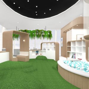
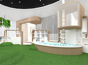
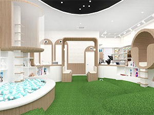
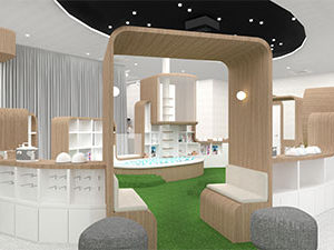
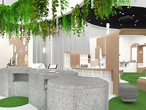
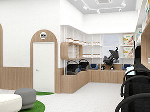
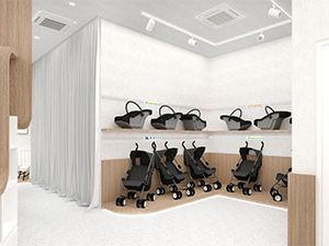
| Project | Babyhub |
| Location | Glenmarie |
| Type | Retail |
| Size | 2500 sqft |
Babyhub offers an enchanting and functional space tailored for little ones. The interiors blend wooden accents with pristine white aesthetics, giving a sense of warmth and purity. Unique arch-shaped doorways and furniture pieces add whimsy to the environment. The storage units are meticulously designed, making it convenient to house essentials like strollers and baby accessories. A striking feature is the central area with a green carpet resembling grass, flanked by plant-adorned shelving and a captivating ceiling with starry lights. The room also boasts interactive zones, like the ball pit, to ensure both fun and learning for babies. Overall, Babyhub presents a harmonious blend of playfulness and practicality.

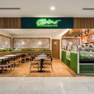
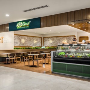
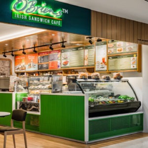
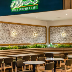
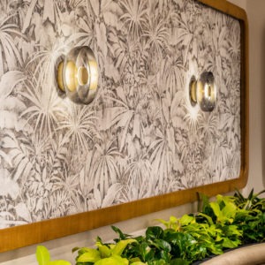
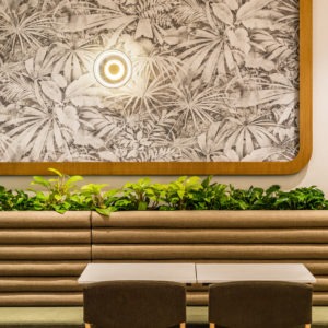
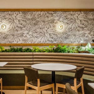
| Project | O'Briens |
| Location | Pantai Hospital (Bangsar) |
| Type | Retail |
| Size | 850 sqft |
O’Briens Irish Sandwich Cafe presents a refreshing and modern take on cafe design. The interior boasts a harmonious blend of earthy wooden textures, complemented by muted green and beige tones. The seating area is adorned with plush, ribbed leather benches that offer a cozy ambiance, ideal for relaxed dining. A prominent feature is the beautifully detailed monochrome wall artwork that showcases intricate leaf patterns, further elevated by embedded lighting fixtures. The cafe counter, with its vibrant green facade, stands out against the subtle backdrop, while an array of delicacies displayed entices patrons. The overall layout is spacious and welcoming, with ample lighting and a combination of traditional and contemporary elements, reflecting the cafe's Irish roots in a chic, urban setting.
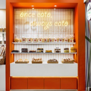
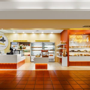
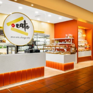
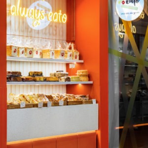
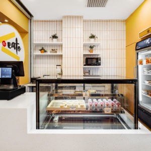
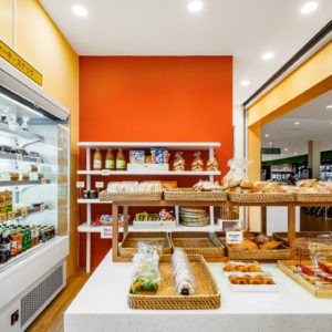
| Project | EC Eato |
| Location | Citta Mall, Ara Damansara |
| Type | Retail |
| Size | 650 sqft |
In the bustling heart of the city lies EC EATO, a bakery that is a testament to blending flavor with contemporary design. EC EATO stands out with its expansive collection of artisanal baked goods, showcased through transparent display counters, allowing onlookers to marvel at the culinary artistry within. The brand's distinctive identity is accentuated by its crisp white "EC EATO" signage set against a rich, vibrant backdrop. Their memorable tagline, "once eat, always eat," is not just a nod to the delectable flavors but a testament to the bakery's commitment to unparalleled quality. The modern design, juxtaposed with the lively orange hues and pristine whites, finds its grounding in the rustic charm of terracotta-tiled flooring. Having had the privilege to design the interiors for EC EATO, we aimed to create a space that reflected both tradition and innovation. The end result is a bakery that offers not just a gastronomic experience but a visual journey that speaks volumes about the brand's essence.
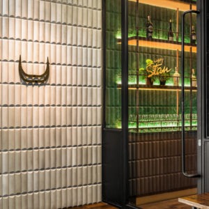
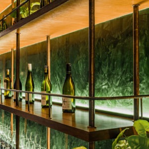
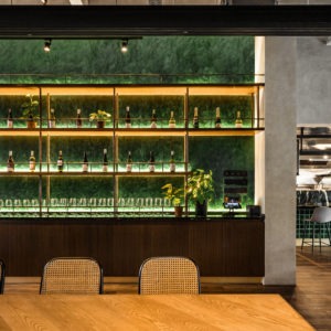
| Project | Happy Stan |
| Location | Damansara Heights |
| Type | Retail |
| Size | 1400 sqft |
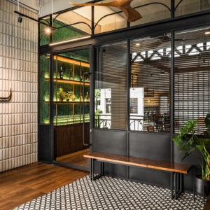
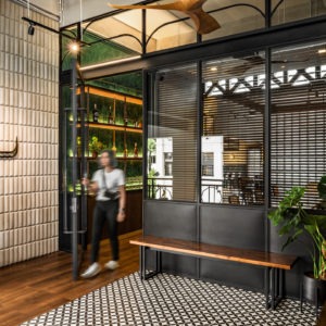
Happy Stan stands as a vibrant destination for culinary enthusiasts and social gatherers alike, where the allure of a modern restaurant and bar comes to life. The venue's shelving, a visual homage to a sophisticated wine cellar, displays a curated selection of bottles against a lush green backdrop, creating an enchanting contrast. In the dining area, a blend of contemporary and timeless furniture invites diners to linger in comfort, while overhead, ambient lighting adds a layer of warmth to the space. Glass and metal elements frame the entrance, offering a glimpse into the establishment's chic interior where patterned flooring lends a playful nod to classic aesthetics. Happy Stan is tailored for those seeking a space that marries the relaxed charm of a bar with the refined taste of a high-end restaurant.
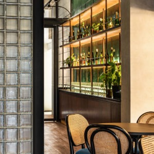
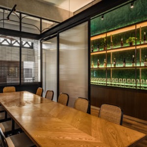
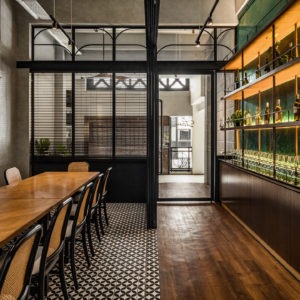
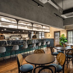
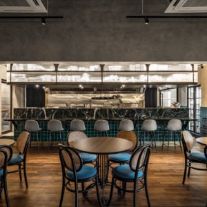
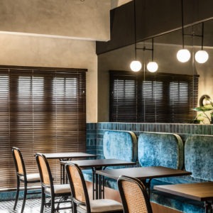
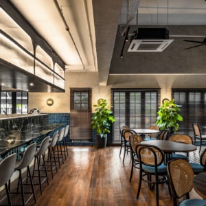
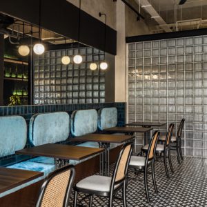
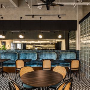
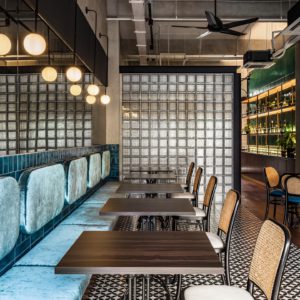
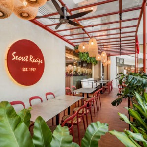
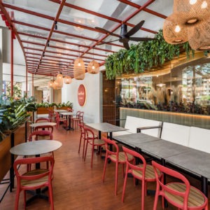
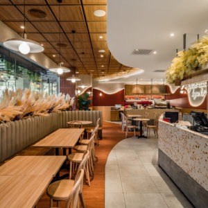
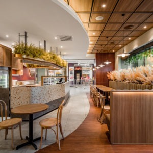
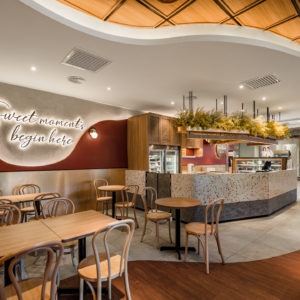
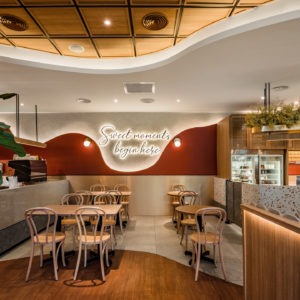
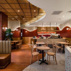
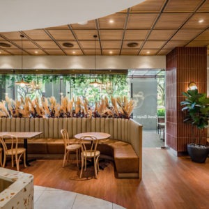
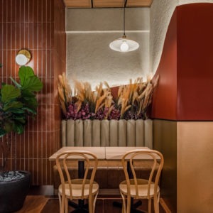
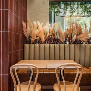
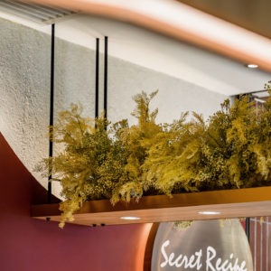
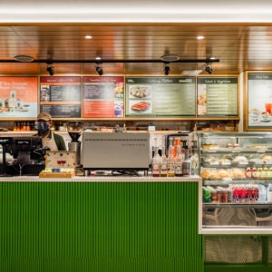
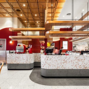
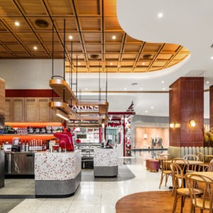
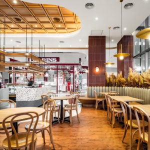
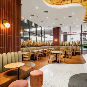
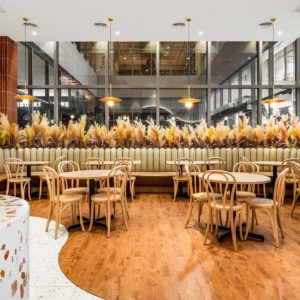
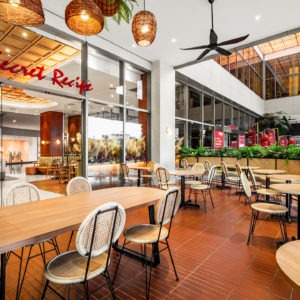
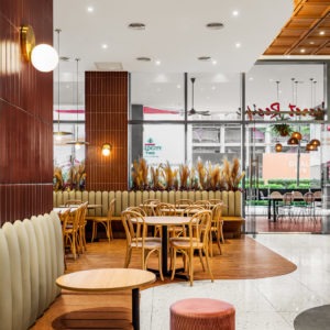
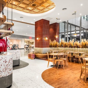
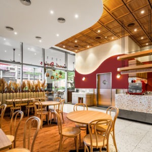
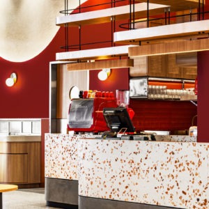
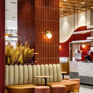
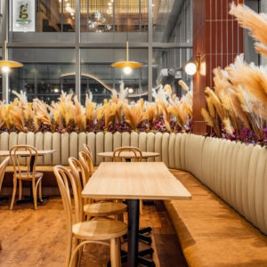
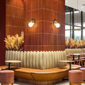
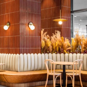
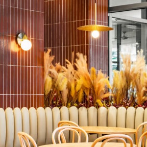
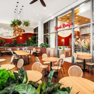
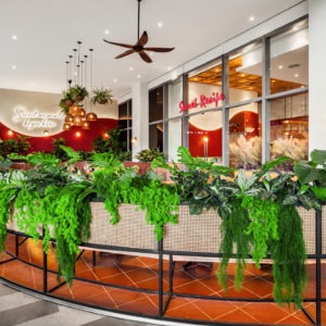
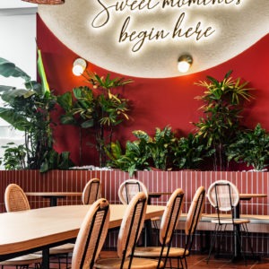
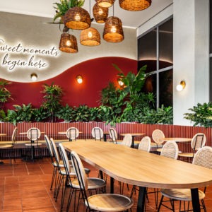
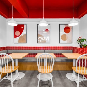
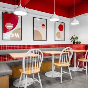
| Project | Secret Recipe |
| Location | Sunway Velocity |
| Type | Retail |
| Size | 3500 sqft |
The Secret Recipe outlet in Sunway Velocity Mall has been designed to offer a chic and welcoming atmosphere that complements their delightful culinary offerings. As an interior designer, the focus was on creating an environment that encourages diners to relax and indulge. The space utilizes a warm and inviting color palette, with rich red tones and natural wood accents that add depth and a sense of comfort.
The seating area is thoughtfully arranged with rattan-back chairs that nod to a classic style, while plush sofas offer a more intimate dining experience. Overhead, modern lighting fixtures provide a soft, ambient glow. The incorporation of lush greenery against the walls not only adds a vibrant touch of life to the setting but also enhances the space with a fresh, airy feel.
The café’s welcoming appeal is further reinforced by the engaging wall art that reads "sweet memories begin here," setting the tone for an enjoyable visit. The architectural design elements, like the grand arches and the ceiling’s wooden accents, elevate the overall dining experience, offering guests a sense of luxury and escape within the bustling mall. The design of Secret Recipe in Sunway Velocity Mall aims to create a harmonious balance between elegance and homeliness, ensuring a memorable visit for every guest.
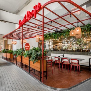
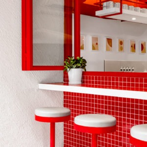
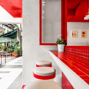
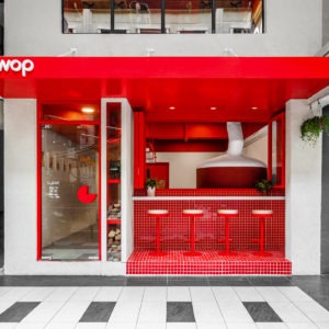
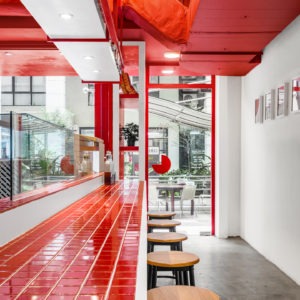
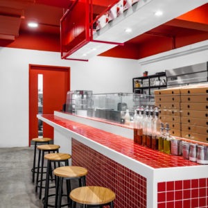
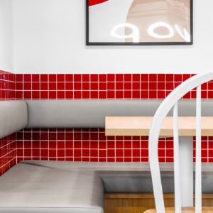
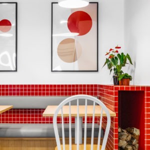
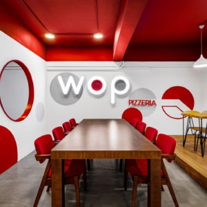
| Project | WOP KL |
| Location | Hartamas Shopping Center |
| Type | Retail |
| Size | 1580 sqft |
WOP Pizzeria is a celebration of bold flavors and contemporary design, a space where vibrant energy and culinary passion meet. The interior is a visual feast, with a striking red and white color palette that evokes the essence of Italian zest. Signature circular motifs and large wall lettering amplify the brand's presence, creating an atmosphere that's as lively as the dishes served.
Communal tables offer a convivial dining experience, fostering the shared joy that comes with a good meal, while high stools at the counter welcome those in search of a quick yet satisfying visit. The red-tiled counter is a standout feature, embodying both the functionality of the bustling kitchen and the spirited heart of the pizzeria.
Outside, the bold red canopy and inviting seating arrangement extend a warm welcome to guests, making WOP Pizzeria not just a dining spot but a landmark of modern Italian charm in the urban landscape. It's a place where every visit promises a slice of delight and a taste of exuberant dining culture.
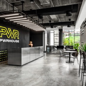
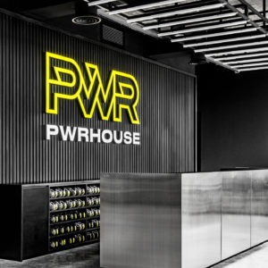
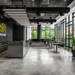
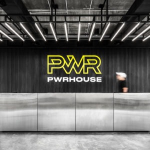
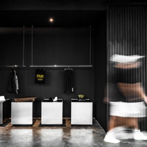
| Project | PWRHOUSE |
| Location | Sri Hartamas |
| Type | Retail |
| Size | 6000 sqft |
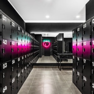
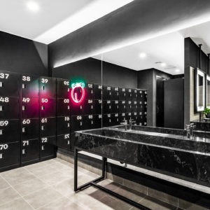
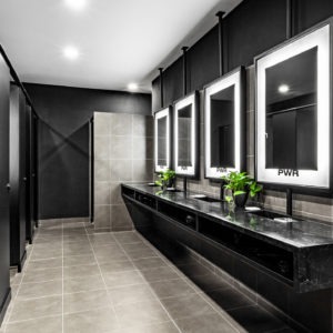
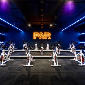
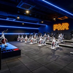
PWRHOUSE gym is a cutting-edge fitness destination that embodies the energy and intensity of a high-powered workout. The space is defined by its bold use of lighting and color, creating an environment that motivates and excites. The main workout area is a testament to this, with its striking green neon lights that crisscross the ceiling, casting an invigorating glow over the sleek, monochromatic floor.
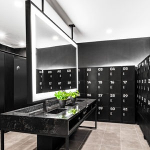
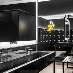
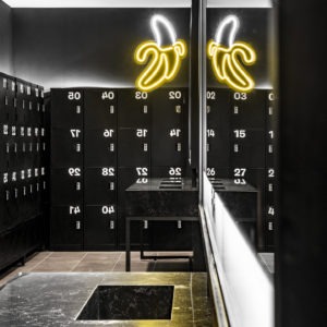
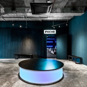
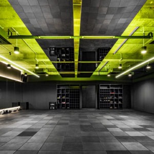
The locker room continues the dynamic theme, with vibrant pink lighting that contrasts against the dark lockers, infusing the space with a futuristic feel. The spin studio is a beacon of motivation, illuminated by blue neon lights that create an electrifying atmosphere, complemented by the powerful "PWR" signage that inspires every movement.
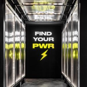
The entryway is an immersive experience with its mantra, "Find Your PWR," artistically illuminated to energize members as they begin their fitness journey. The reception area balances the gym's vibrant aesthetic with a more grounded, industrial chic vibe, featuring concrete floors and ample natural light. PWRHOUSE is not just a gym; it's a destination designed to unleash the full potential of its members through a meticulously crafted environment that's as visually stimulating as it is physically challenging.
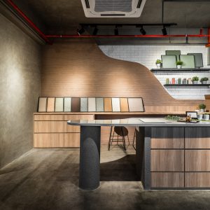
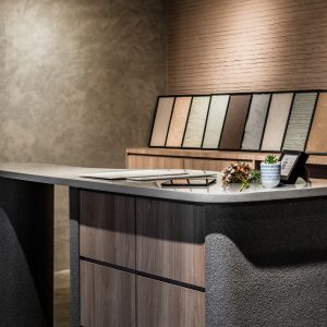
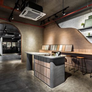
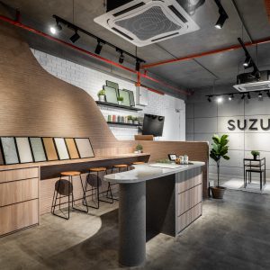
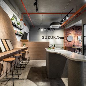
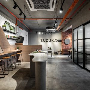
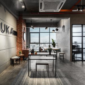
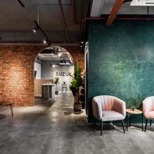
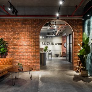
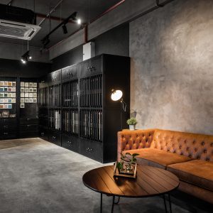
| Project | Suzuka Showroom |
| Location | 163 Retail Park, Mont Kiara |
| Type | Retail |
| Size | 1300 sqft |
The challenge:
Named the ‘Suzuka Lounge’, this is a showroom that aims to give walk-in customers a different experience. Instead of merely showcasing material samples and brochures as most showrooms would, the Suzuka Lounge enables customers to ‘live’ within the space. How do we achieve this?
The Ground Up solution:
Think of a showroom. Do you imagine endless shelving racks, display cases, and possibly samples and brochures that are squirreled away into cabinets? Instead, we wanted to present a livable, immersive showcase where customers can experience the space as if it’s their very own home or office. By using Suzuka’s products and giving it a real-world application and 1:1 scale context, we are providing visitors an interactive experience where they can see for themselves what it’s like to apply these products in their space.
The solution is also crafted to help interior designers find inspiration & make it a more convincing pitch to sell Suzuka products to their clients. Informative, educational, fun and very much instagrammable, we’re proud to have been part of changing the showroom scene.